|
|
 | |  |
|
The most common size of 300x400 for the main character does not take up much space on the desktop.
Hardly bothers me in most applications, whether surfing, text editing, not even too much in image editing.
But only applies if the main character is solo or the secondary character is quite small.
I almost always have a ghost running in the foreground.
Websites are usually structured in such a way that the essential is more on the left side or the main content to be read
is in a median, a navigation bar on the left, maybe also one on the right and even if the right one is quite long,
it's still not too annoying. If there's advertising on the right, I'm fine with covering it up!
This is the case with the center strip: otherwise lines of text that are too wide are harder to read.
That is why the text in newspapers and magazines is set in columns!
Only e.g. in the case of articles on Wikipedia, one has probably not yet understood this!!
A strip on the right could accommodate the explanatory pictures, unfortunately none and the text runs to the very edge.
The main character can also be a little taller...
Up to about 400 pixels in width and 600 to at most 700 in height.
But you shouldn't bring more for a screen resolution of 1920x1080. (above only for 4k!)
Depictions in which the character is cut off somewhere below the groin
and also wears a wide dress are bad... (like too many Japanese ghosts)
Many websites and programs have an info or function bar at the bottom that could be covered!
Complete characters with feet are better. Standing, kneeling, sitting - lying down is not so good!
Lying needs too much width, sitting maybe turned to the side, feet to the left, better not to the right.
The complete characters can easily be set a little higher with a spacer strip to the base line!
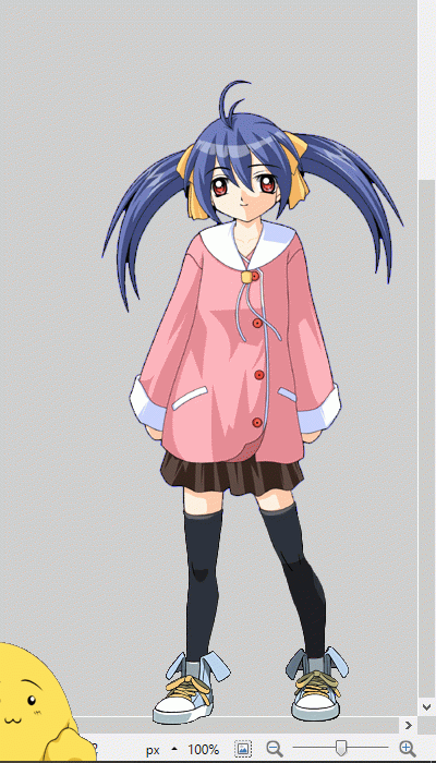
On the right is an example with a screenshot from paint.net with Nanashi in the foreground, here also with scroll bars.
The section is 400x700, whereas Nanashi's surfaces have a size of 350x648, so only slightly smaller.
The width of 400 is also more suitable for characteres with spread arms, standing or kneeling,
where only the hands cover more of the desktop, but only small areas.
The representation of the secondary character is sub-optimal here, because no complete character
and thus partly covering the function bar!
Nanashi is already too big for you? Well, the ideal size for complete characters is maybe 300x560,
I have quite some of those...
Two characteres of about the same size are another chapter and take up much breadth unless small but not fine,
because there is not much to see there. In addition, the problem of balloon positioning arises even there.
|
 |
|
 | |  |
|